
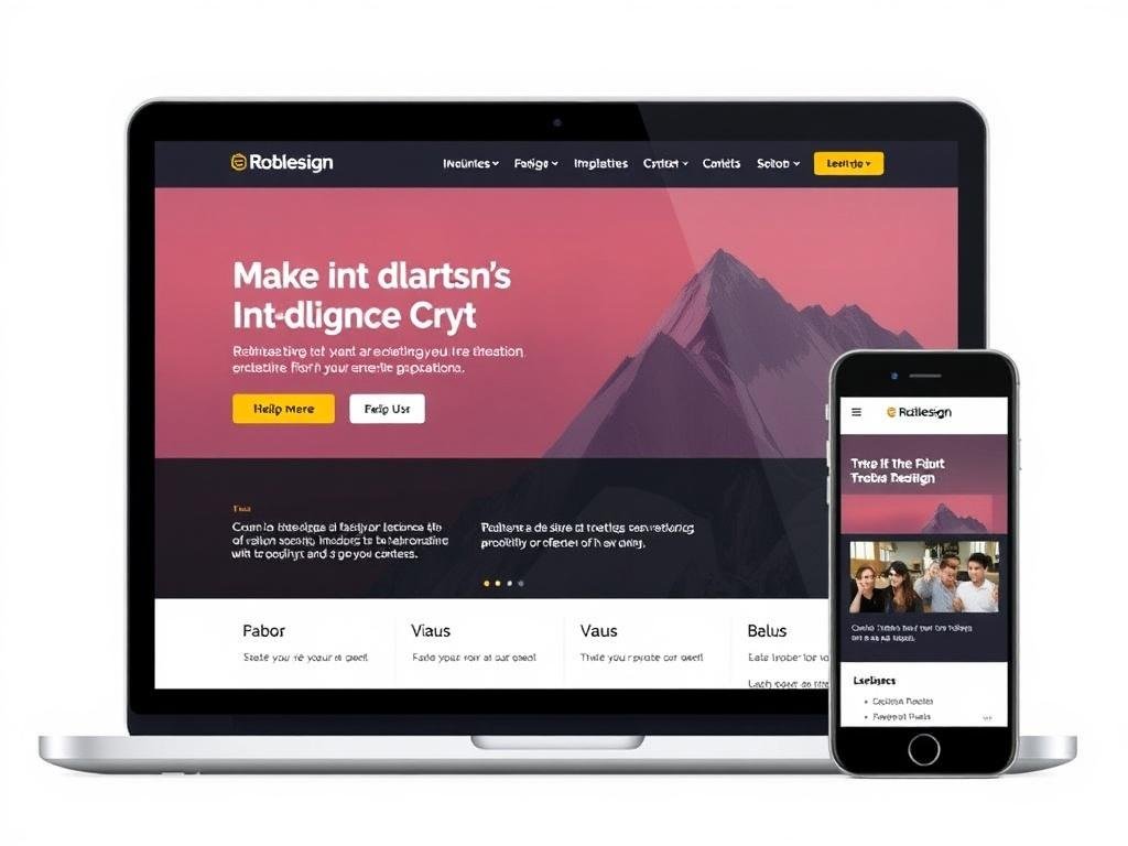
Good design feels inevitable: the layout, colors, and interactions all make sense the moment you use a site. Getting to that point requires more than taste; it demands a process that blends creativity, user empathy, and engineering. This guide walks through why those elements matter, how teams turn ideas into pages that perform, and what practical steps any designer or developer can take to make sites that people actually use.
Why design and development are partners, not opponents
Too often the room that decides a website’s fate treats visual design and technical implementation as separate silos. That separation creates handoff friction: assets that don’t scale, interactions that fall apart on certain devices, and timelines that explode when something “simple” turns out to be expensive to build. Thinking of design and code as collaborative phases reduces surprises and produces a more coherent product.
Collaboration means talking early and often. Designers who understand constraints such as load budgets and component libraries make different decisions up front, and developers who understand user goals can suggest feasible alternatives that still meet the experience intent. I’ve worked on projects where a single conversation about animation timing saved days of back-and-forth and led to a smoother result for users.
Understanding goals before starting
Every site should answer one or two clear questions for visitors: what is this, and what should I do next? Start with the business and user goals rather than the visual mood. Defining measurable outcomes—newsletter sign-ups, purchases, lead form submissions—gives the project focus and makes later trade-offs clearer.
Stakeholder interviews and quick user research are cheap insurance. Even a handful of short calls or a simple survey can expose assumptions that would otherwise steer the design in the wrong direction. Layer that with competitive analysis and you’ll avoid reinventing patterns that already work for your audience.
User experience: more than pretty pixels
Experience design is the backbone that supports visual choices. It’s about reducing cognitive load, smoothing decision paths, and helping users feel confident about their next step. When you prioritize clarity over cleverness, more people will complete tasks and return to your site.
Map user journeys for the primary tasks and identify friction points—places where form fields, unclear copy, or slow responses cause drop-off. Design interventions can be small: microcopy that clarifies intent, progressive disclosure of advanced options, or a single prominent call-to-action that reduces confusion.
Information architecture and content hierarchy
Structure is a silent guide; when it’s right, users find things without thinking. Start by inventorying content, grouping related pages, and organizing navigation around user mental models rather than internal team silos. A sensible IA reduces search dependence and creates clearer paths to conversion.
Headings, lists, and meaningful labels matter as much as layout. Good content hierarchy helps users skim and scan, which most visitors do. Use real copy early in the design process whenever possible—placeholder lorem ipsum hides problems that only real content will reveal.
Interaction design and microcopy
Small interactions and the words that accompany them shape trust. Button labels, error messages, and success confirmations either reassure or confuse. A concise label like “Save changes” beats vague phrasing, and helpful error text that explains how to fix the problem prevents abandonment.
Think about feedback loops: what happens after a click? Visual loading indicators, disabled states for in-progress actions, and subtle animations can communicate system status. Too much motion distracts; too little leaves users guessing. The aim is clarity with personality, not gimmicks.
Visual design: choosing a visual language
A visual system is more than color palettes and typography; it’s a toolkit you reuse across pages for consistency. Define a modest set of components—buttons, input fields, cards, and navigation—and apply them deliberately. Consistency reduces cognitive load for users and speeds up future work because designers and developers share expectations.
When choosing colors, consider hierarchy and accessibility. Contrast ratios affect readability for everyone, and color should never be the only indicator for important states like errors or success. Typographic scale creates rhythm: establish clear relationships between headings, subheadings, and body text and stick to them.
I once redesigned a nonprofit’s donation page using only three type sizes and a constrained color palette. The simplicity forced better content decisions and the resulting layout increased clarity without adding visual noise. Small constraints can produce stronger outcomes.
Responsive and accessible design
People visit sites on a dizzying range of devices and situations. Responsive design is no longer optional; it’s the baseline expectation. Start layouts with mobile in mind, and progressively scale up to tablet and desktop so you prioritize critical content for the smallest screens first.
Accessibility is part of good design, not a separate compliance checklist. Semantic HTML, proper focus management, keyboard navigability, and descriptive alt text make sites usable for more people and more robust overall. Accessibility improvements often improve SEO and device compatibility as a side benefit.
Test on actual devices when possible. Emulators are useful, but real hardware reveals performance quirks, font rendering differences, and touch behaviors that otherwise slip through. A simple screen reader pass and keyboard-only navigation will surface common accessibility issues quickly.
Front-end and back-end: the mechanics behind the scenes
On the surface a web page looks static, but it relies on a stack of technologies that work together. The front-end translates design into interactive elements using HTML, CSS, and JavaScript. The back-end handles data, business logic, and integrations with services like payment processors or CRMs.
Thinking about these layers early helps avoid late-stage compromises. For example, a designer might specify a dynamic filtering interface that requires thoughtful API endpoints and caching strategies. Conversational planning between designers and developers ensures the final product stays faithful to the original intent without becoming fragile.
Performance and loading speed
Performance affects perception as much as visuals. A site that looks gorgeous but loads slowly will lose users quickly. Prioritize fast, meaningful paint—get the content users care about on the screen first and defer nonessential features. Optimized images, careful font loading, and limiting blocking scripts all contribute to speed.
Tools like Lighthouse or WebPageTest give actionable metrics, but interpret them in context. Delivering a slightly slower but more usable experience can be better than obsessing over a synthetic score. The real goal is consistent responsiveness during real-world use.
Progressive enhancement and graceful degradation
Progressive enhancement starts with basic functionality that works everywhere and layers on advanced features for capable browsers. This approach produces resilient experiences that still function when JavaScript fails or network conditions are poor. It’s a practical philosophy that yields fewer brittle interactions.
Graceful degradation accepts that not all environments will support every visual or interactive flourish, and designs fallback experiences intentionally. Map out what elements can be simplified without losing core value so users still complete key tasks on older devices or behind restrictive firewalls.
Tools and workflows: from sketch to launch
The modern toolchain spans design, prototyping, version control, and deployment. Popular design tools and component libraries let teams iterate quickly and maintain consistency. Meanwhile, version control systems like Git keep code organized and make collaboration safer by tracking changes and enabling rollbacks.
Prototypes bridge the gap between static mockups and production code. They allow stakeholders to experience flows early and reveal misunderstandings before development starts. A clickable prototype that imitates critical interactions often exposes navigation issues and content gaps faster than any review of static images.
I prefer a workflow that pairs atomic design with early prototyping. Building a small set of reusable components creates a shared language and reduces duplicated effort. When designers and developers work from the same component catalogue, iterations happen faster and deployment becomes more predictable.
Testing, iteration, and analytics
Design isn’t finished at launch. Real user behavior will reveal where the experience breaks down or where opportunities exist to simplify conversion paths. Instrument pages with analytics and qualitative tools so you can observe drop-off points and click patterns without guessing.
A/B testing is a disciplined way to validate hypotheses, but prioritize small experiments with clear success metrics. Changing a button label or simplifying a form field is often more effective than redesigning whole pages at once. Over time, cumulative small improvements compound into significant gains.
Combine quantitative data with occasional user sessions or support transcripts to understand why people behave the way they do. Numbers tell you what happened, and users tell you why it happened; together they guide sensible iterations.
Design vs development: roles and responsibilities
Teams sometimes blur responsibilities, which can be healthy or harmful depending on how it’s managed. Designers own the vision for experience and visual language, while developers ensure the solution is performant, secure, and maintainable. Mutual respect for those domains keeps projects moving smoothly.
The following table outlines common responsibilities so teams can align expectations quickly.
| Area | Typical responsibilities |
|---|---|
| Design | User research, wireframes, visual system, prototypes, microcopy |
| Development | Front-end code, back-end logic, integrations, testing, deployment |
| Shared | Performance optimization, accessibility, QA, iterative improvements |
Working with clients and teams
Communication is the design tool that never goes out of style. Set expectations early about scope, milestones, and what success looks like. Transparent roadmaps and regular demos reduce the need for last-minute changes and help stakeholders stay engaged without derailing the process.
Scope creep is a common pitfall. Combat it with a clear change request process and prioritized backlog. When new requests arrive, articulate trade-offs in terms of time, cost, or quality so stakeholders can make informed decisions rather than piling on features that kill momentum.
From personal experience, simple rituals—weekly check-ins, live prototype walkthroughs, and shared agendas—keep projects anchored. When a client has visibility into the design thinking and the rationale behind choices, approval cycles shorten and trust grows.
Common mistakes and how to avoid them
There are recurring missteps that teams make: starting with visuals before understanding users, overcomplicating navigation, neglecting performance, and ignoring accessibility. Each is avoidable with a bit of discipline and a commitment to testing ideas early.
Addressing these mistakes usually requires small, practical changes rather than radical overhauls. Keep a short list of non-negotiables—accessibility checkpoints, mobile-first layouts, and a performance budget—and use them as guardrails during design reviews.
- Designing for the designer, not the user—use research to ground choices.
- Overloading the homepage—prioritize calls to action and reduce noise.
- Using images without optimization—compress and choose formats wisely.
- Ignoring real-world testing—test with people and devices, not only emulators.
Keeping skills sharp and trends to watch
The field evolves quickly, but fundamentals remain useful. Strong layout sense, typographic control, and an understanding of web performance will serve designers and developers for years. Pair that foundation with curiosity about new patterns and tools that might genuinely speed up delivery.
Current trends worth watching include component-driven design systems, design tokens for cross-platform consistency, and responsible use of machine learning to speed repetitive tasks. AI can assist with ideation and content variations, but human judgment remains essential for crafting meaningful experiences.
Costs, timeframes, and realistic expectations
Clients often want fast turnarounds and low prices, but quality work takes time and iteration. A simple brochure site might be achievable in a few weeks, whereas a feature-rich application with integrations and custom workflows will require months of planning, development, and testing. Aligning timelines with scope at the outset prevents disappointment.
Budgeting should account for maintenance. A site isn’t a one-off deliverable; it needs updates, security patches, and occasional content changes. Discuss ongoing responsibilities early and consider maintenance retainers or schedules to keep the product healthy after launch.
Building a portfolio and finding work
A portfolio is both proof of ability and a storytelling tool. Instead of listing screenshots, describe problems you solved, your role, constraints, and measurable impact when possible. Clients and hiring managers appreciate process insight as much as visual polish.
Seek projects that stretch your skills in small ways—work on a different industry, try a new interaction pattern, or contribute to open-source components. Those experiences build depth and make your portfolio more compelling than a string of similar-looking sites.
Practical checklist before launch
Before you flip the switch, run a checklist to catch common oversights. This reduces last-minute panic and ensures the live experience aligns with expectations. Use both automated and manual checks to cover technical and human-facing issues.
- Validate core user flows on multiple devices and browsers.
- Run accessibility tests and fix keyboard/focus issues.
- Optimize images and check font loading strategies.
- Verify analytics, tracking, and any third-party integrations.
- Confirm backups, roll-back plans, and DNS propagation steps.
Working examples: a small redesign that made a difference
A local community organization asked me to redo their event registration page. The original design buried the registration form beneath long paragraphs and an image carousel that auto-played. We restructured the page so the sign-up form appeared above the fold on mobile and replaced the carousel with a single hero image and a concise value statement.
We didn’t change the organization’s mission or add a complicated feature; we clarified the path to action. After launch, the team reported smoother registrations and fewer calls asking where to sign up. That project reminded me that sometimes the highest-impact work is letting users get to what they want faster.
When to bring in specialists
Not every project needs a separate accessibility consultant or a performance engineer, but know when to call them in. If you’re building for regulated industries, heavy integrations, or complex user workflows, specialist expertise early on avoids rework and compliance headaches. Plan for expert reviews at key milestones.
Similarly, if your project includes advanced animation, real-time data, or heavy third-party dependencies, have experienced developers estimate implementation effort. Their input will shape design decisions and keep timelines realistic.
How to learn by doing
One of the fastest ways to learn is to pick a small personal project and take it from concept to deployment. Treat it like a mini-client engagement: define goals, sketch wireframes, build components, and publish. The constraints of a single-person project force pragmatic choices and surface trade-offs that theory alone cannot teach.
Document what you try and what you learned. That documentation becomes raw material for your portfolio and a reference for future projects. Iteration cycles are shorter on personal work, so you can experiment with design systems, testing approaches, and new technologies without high stakes.
Practical advice for solo designers and small teams
When resources are limited, prioritize the experiences that deliver the greatest user and business value. A single clear call-to-action, clean navigation, and well-written content will typically outperform a complex visual refresh that doesn’t address user needs. Choose simplicity and polish over unnecessary features.
Automate repetitive tasks where possible—use simple build scripts, design tokens, and a small component library. Those investments save time as your site grows and reduce inconsistencies that creep in when different people make ad-hoc choices.
Final thoughts on craft, collaboration, and care
Great web projects are the product of craft and collaboration. They require decisions that balance beauty, clarity, and performance, and they benefit from teams that communicate with respect for each other’s expertise. Design and development are not opposing forces; they are two sides of a problem-solving practice that, when aligned, create experiences people enjoy using.
Start small, test often, and be willing to change direction when data points to a better approach. Treat users as partners in the process by listening and learning from their behavior. With consistent attention to the basics, you can design and build sites that meet real needs and stand up to the messy realities of the web.